
The Project
The Dragon Chamber is a food and beverage establishment that has a coffeeshop facade and a full serviced restaurant accessible only through a secret entrance. The company I'm in was engaged to build their online presence and assist with basic collateral to get things in motion at their new location. As we moved forward, we found ourselves getting more hands on with the overall visual identity of the restaurant, which we warmly welcomed.
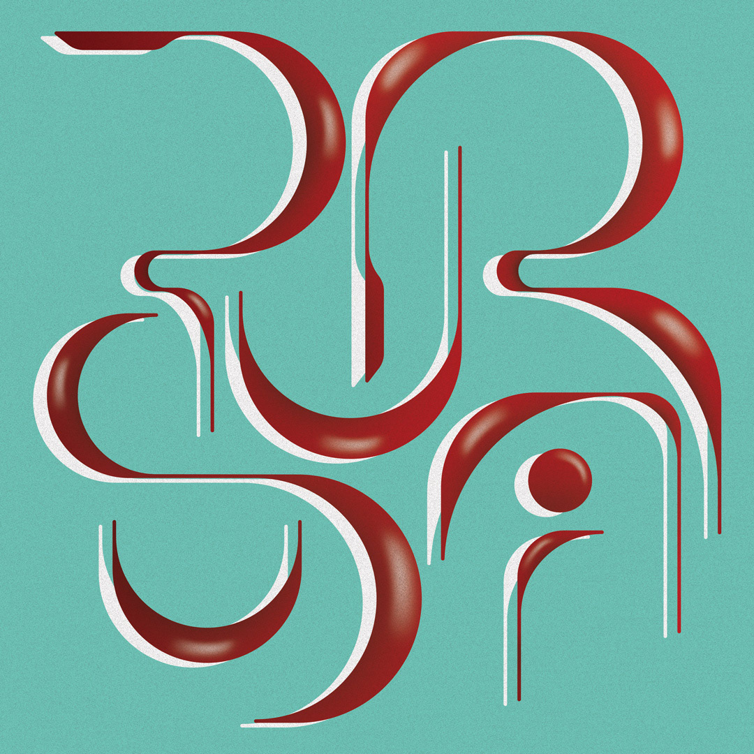
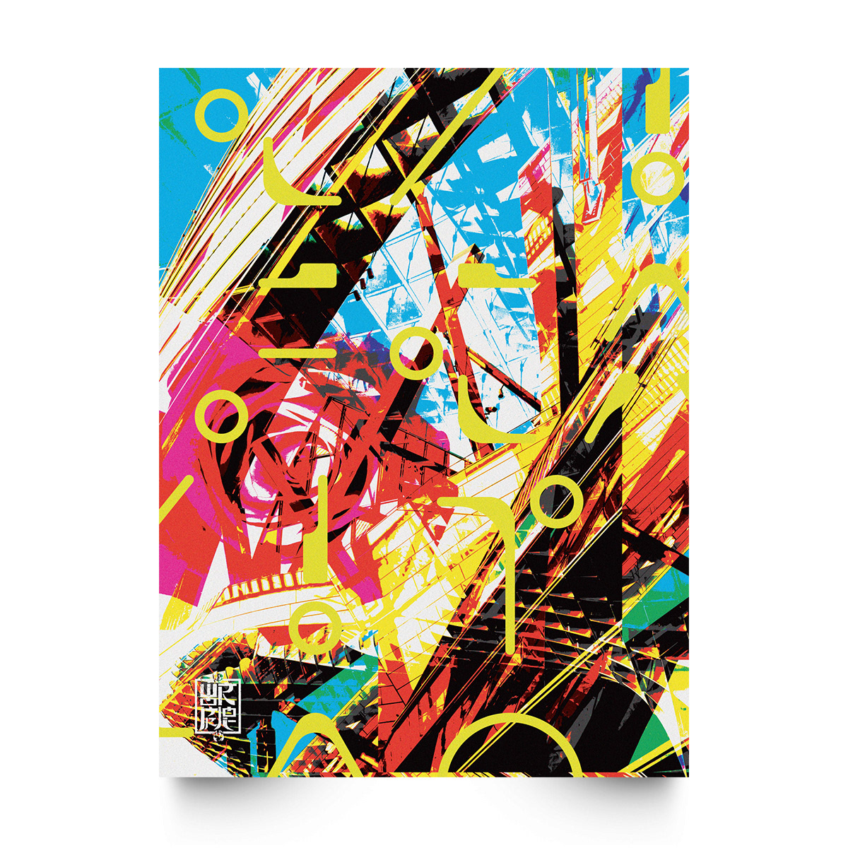
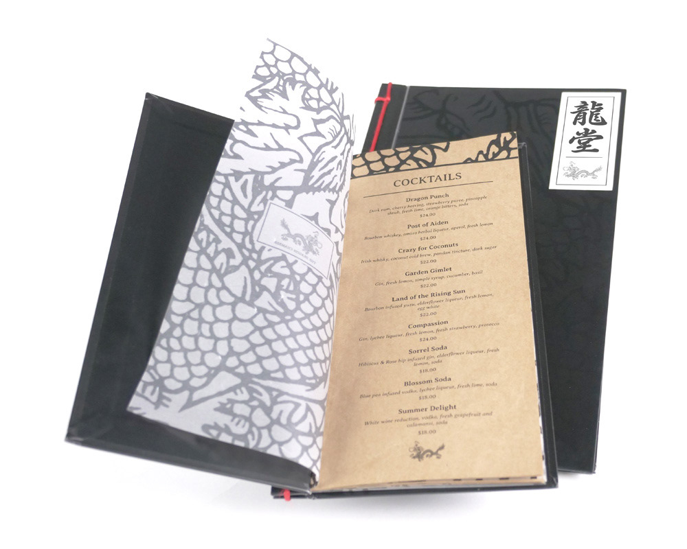
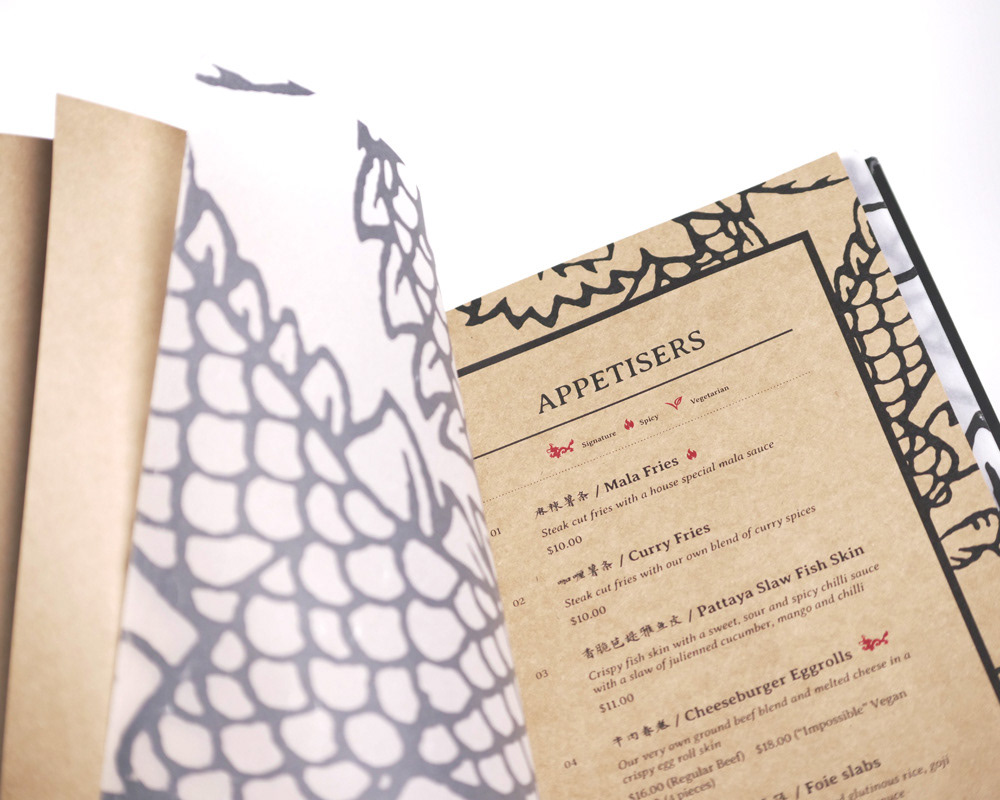
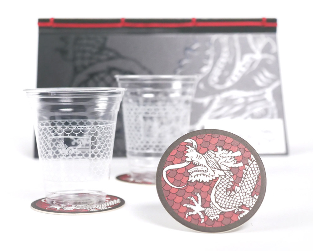
One of these additions was the assistance in the refinement of their logo. This was of grave importance as it sets a prerequisite (the need to be bold, affirmative) in the further application of visuals. This can especially be seen in application throughout the printed assets, where the use of bold lines and supergraphics make the bulk of the design work done.
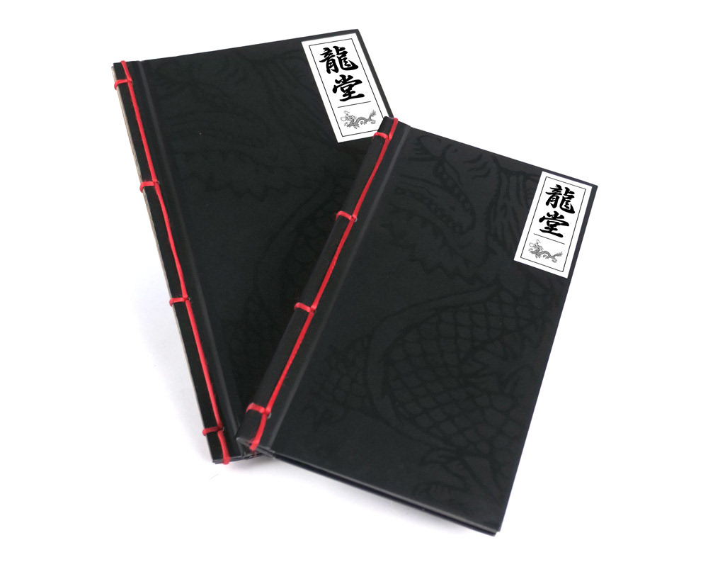
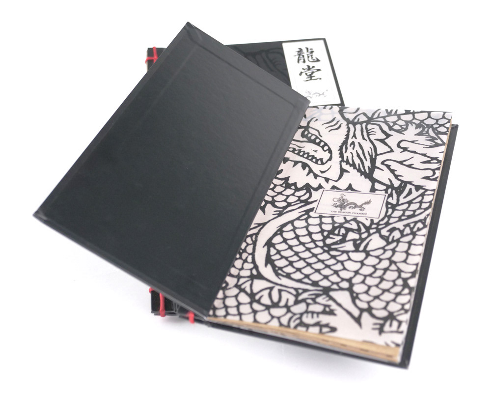
I worked closely with Norman,the Chamber head honcho, with the building of the Chamber visual identity. From the selection of material and binding on the menus, to the overall artistic tone.
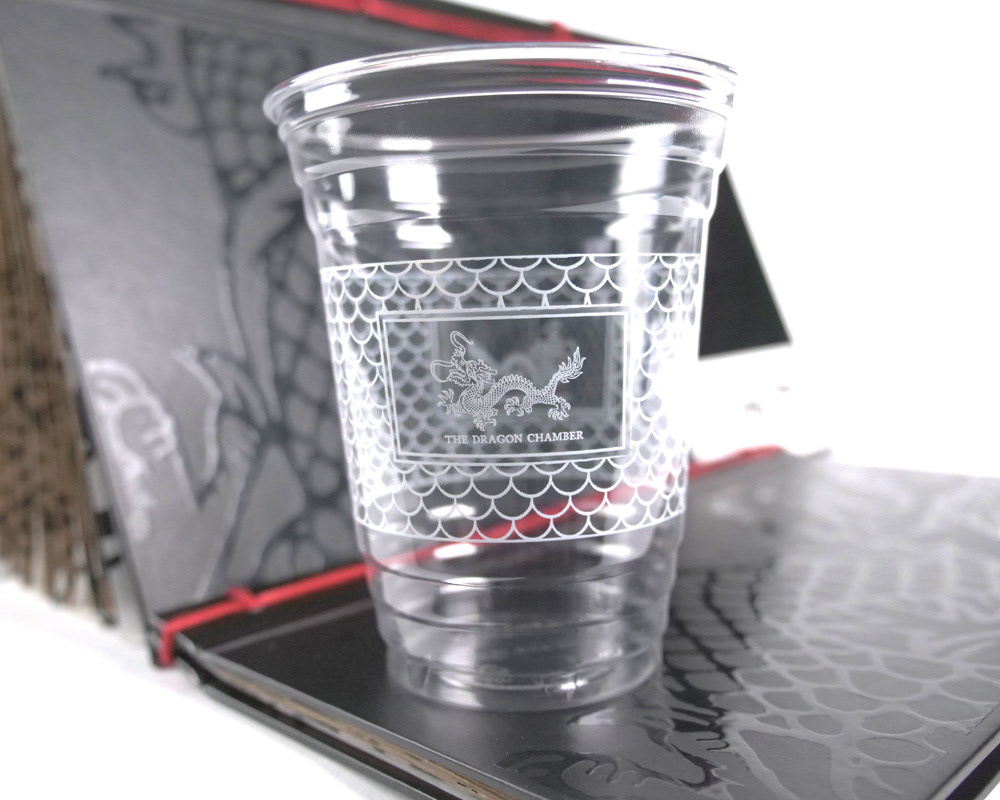
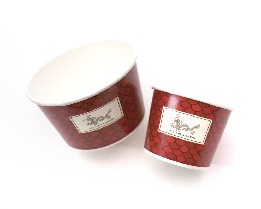
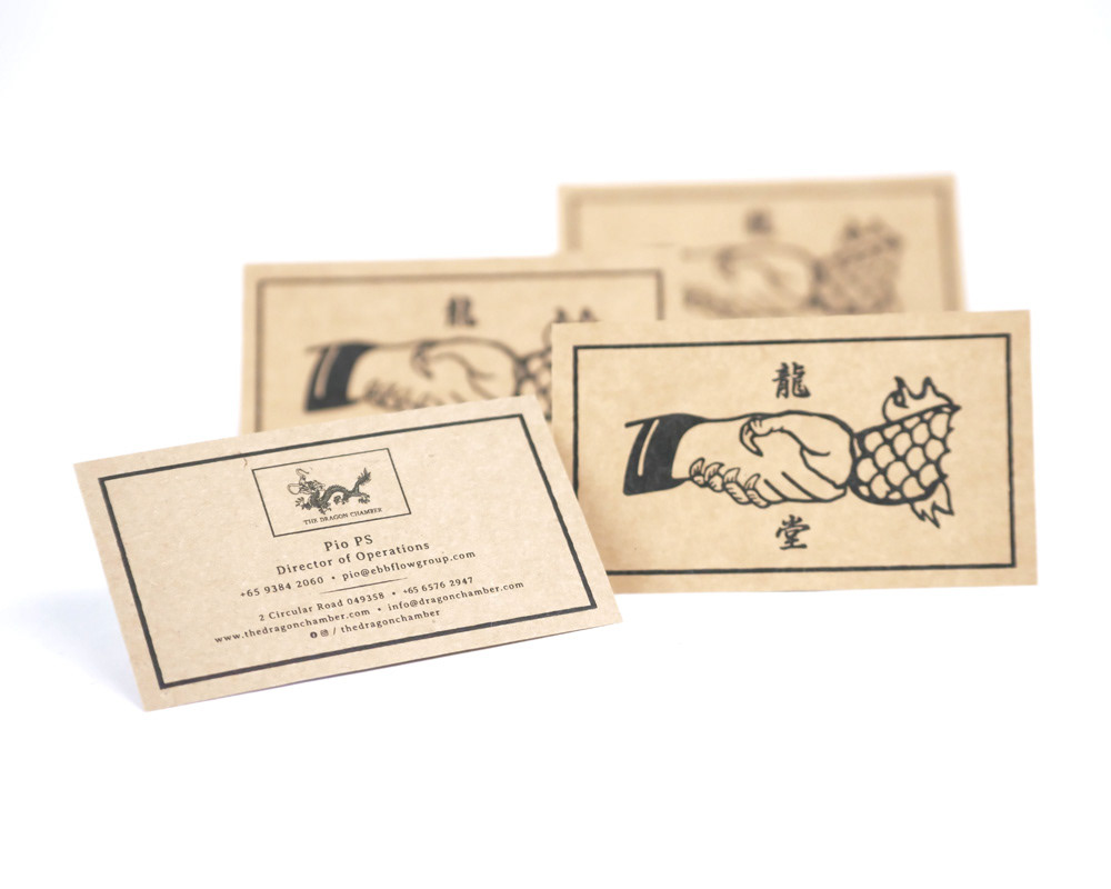
By virtue of being a speak easy restaurant, there was an element of dark overtones that drove the artistic direction of The Dragon Chamber. For instance, the namecard was largely influenced by Norman’s study of the graphics used in membership / greeting cards by secret societies back in the day.
One of these additions was the assistance in the refinement of their logo. This was of grave importance as it sets a prerequisite (the need to be bold, affirmative) in the further application of visuals. This can especially be seen in application throughout the printed assets, where the use of bold lines and supergraphics make the bulk of the design work done.
I worked closely with Norman,the Chamber head honcho, with the building of the Chamber visual identity. From the selection of material and binding on the menus, to the overall artistic tone.
By virtue of being a speak easy restaurant, there was an element of dark overtones that drove the artistic direction of The Dragon Chamber. For instance, the namecard was largely influenced by Norman’s study of the graphics used in membership / greeting cards by secret societies back in the day.