
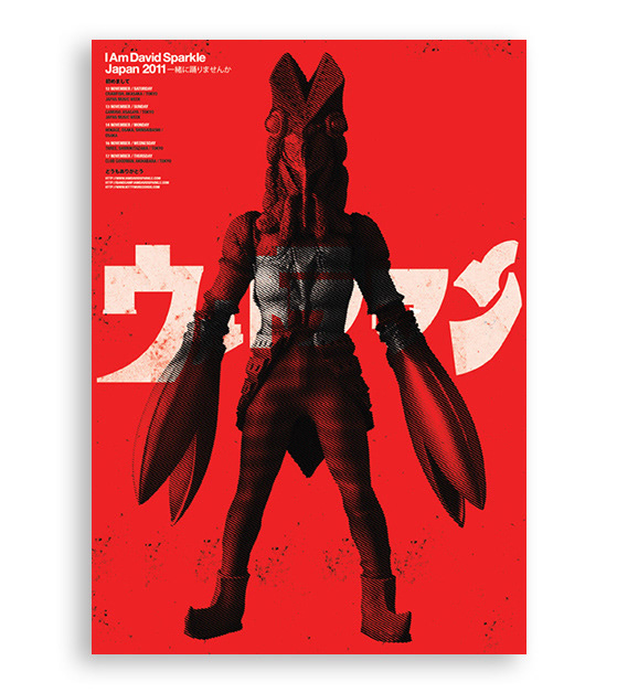
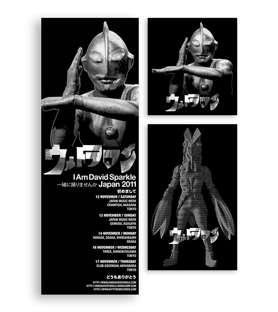
The Project
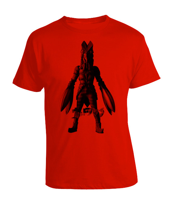
Was a big Ultraman fan growing up, so when this opportunity came, I just had to use it's imagery. The Ultraman opening title logo was modified to accomodate the abbreviation of the band, IADS. Initially the idea was to print on black shirts (using white ink), but the drummer suggested using red, and it turned out pretty ok. Somehow, Japanese letters, to me, make projects look nicer. The Japanese words you see on the poster and flyer are phrases picked out online, which are almost band related. The shirts were handprinted while promo materials were printed digitally.